Simplifying Data Navigation:
Enhancing the In-Home Touch Interface
Due to a non-disclosure agreement (NDA), the specific details of this project have been rebranded, and certain information has been modified to protect client confidentiality.
To know more about this project, please contact me by liujun.d24@gmail.com
Project overview
I was responsible for improving the history log interface within a smart home control system—an application that displays real-time, historical building data and future prediction collected by sensors.
Project outcome
During my problem solving process, I successfully revealed an issue of the ambiguity of the target users and the job-to-be-done for this whole product, delivered clearer and more organized interface and workflow, and helped the company to narrow down the goal of MVP.
Target user
Home owners / Tenants
Design challenge
How to display overwhelming data on a small wall-mounted interface?
At the beginning of this project, the request was to simply add grouping and filtering feature to the history log page.
Then my focus was on the data that users are going to filter and group. During my first round user research and data collection, we found that one single sensor could measure more than one metrics, and one of the demo building could have more than 10 sensors mapped in the building and on the equipment.
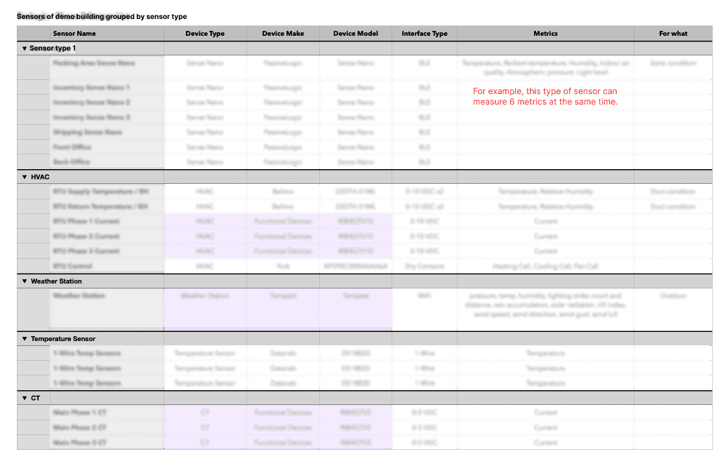
A sensor device chart we collected from our demo building. Sensitive information are blurred.
How does the grouping/filtering tool work to organize those information?
How can users understand and learn the tool quickly to find what they want?
A piece of sensor data could have attributes like Device type, Device name, Metrics (what metrics this data is), Location (where it's collected, from which floor and from which zone). So to group them into meaningful sections at least requires a three-layer grouping.
Plus the depth of each attributes is different, which generates a dynamic grouping widget.
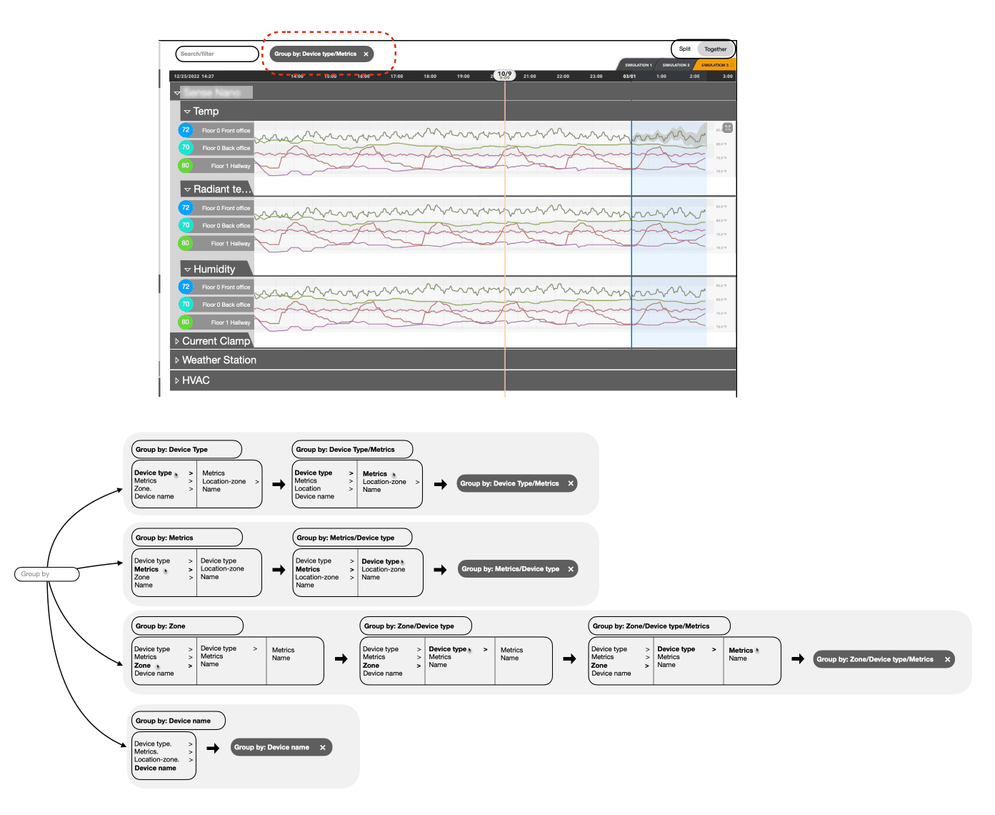
All the scenarios of one grouping widget can generate based on the attributes one piece of data point can have.
When the basic model being laid out, we tested it out with a group of user. And we noticed that only professional users like installers and HVAC engineers understand the functionality, but normal people are all confused by the complexity of it. Then we figured that the expected target users for this section was not optimized.
For the wall-mounted interface, the main targeted users are home owners and tenants, they expect to see the current performance of the building easily and simply, and they would like to notice what and where goes wrong quickly.
For professional users like engineers and installers, they should be able to view and organize the data through their laptop with a more powerful navigation tool.
Then for the second stage of the project, I started to only think from the home owners and tenants' perspective. For normal people, the common understanding of a building is following a hierarchy of Floor - Room - Object. So for them, the easiest way to understand the structure is following this physical structure.
And also, they actually don't care about what each of the sensor reads out, they care more about what rooms and buildings behave. So that we introduced a smart average read out for the room.
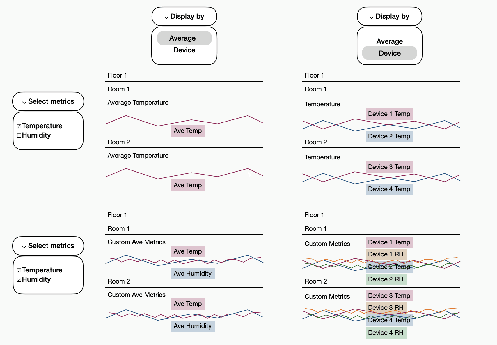
A new hierarchy of the data grouping and categorization was established.
This new approach reduced the 50% of the options, and still achieved users' goal.
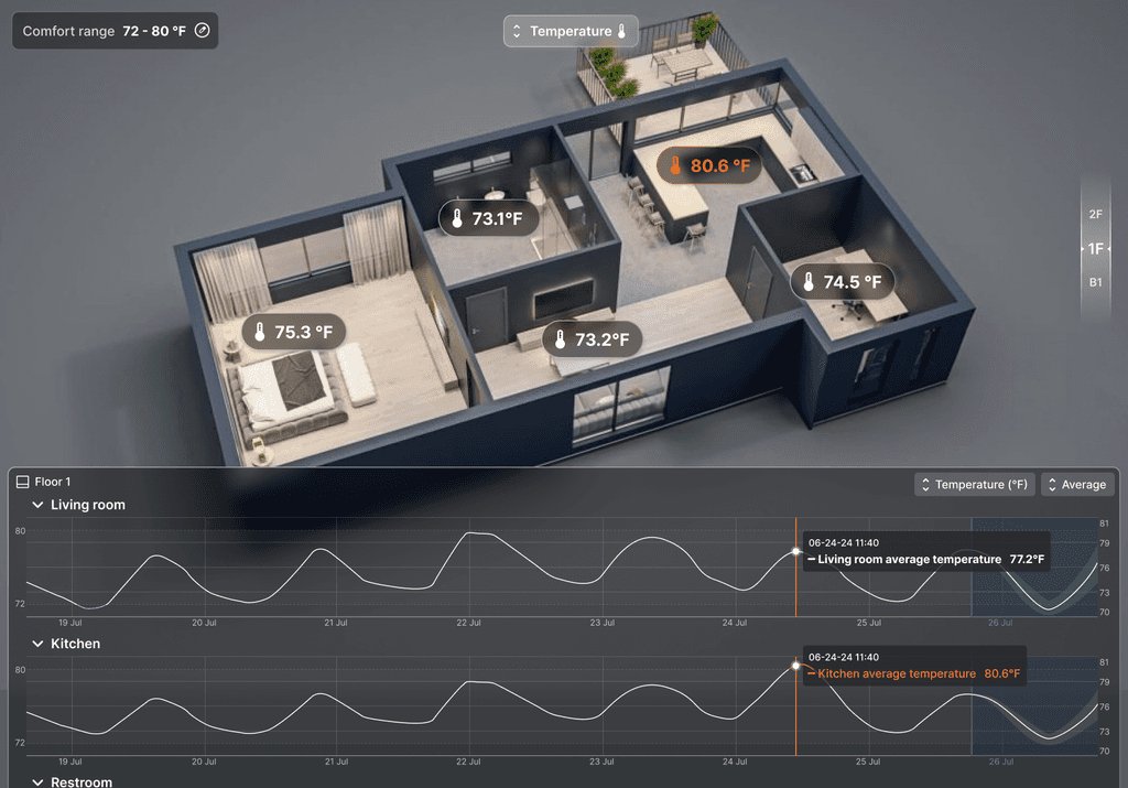
I also designed out-of-range data warning to the read-out display on the model to highlight the errors and issues, letting users to capture what goes wrong even without digging into the graph.
In 1/3 view, users can navigate the data by moving the 3D model

By choosing display by Device, users can see the details of all sensors contributing to the selected metrics.
In full views, location navigation relies on the floor divider.
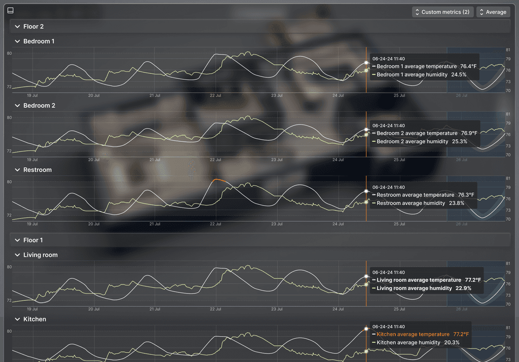
Based on the user interviews, we were aware that putting humidity and temperature together is very common. Users can easily achieve that by custom metrics.
For future release versions, we will have the first version of the grouping feature integrated in the professional mode that is only accessible via desktop to provide professional users with more power.
Reflection